Disappearing
Bees Campaign
Advertising
Project Scope
This project is a school project I’m currently doing in my third year of graphic design. The objective is to take an old design project of ours and redo it to make it reach its full potential. For this project, I decided to redo an infographic I made in my first year. See the original design on the right.
The infographic is titled “Disappearing Bees” and gives information on the issue of the decreasing honey bee population. I chose to redo this infographic because I enjoyed making it and would love for it to reach its full potential.
Purpose & Goal

The purpose of this project is to use the skills I've sharpened and gained over the past two years to improve an old project. It’s also an opportunity to be more innovative and take the design to the next level.
The goal is to create an elevated version of the old project and to visually see how much I've improved as a designer in just a few years.
Planning
The first step of this project was to research some inspiration. I found some unique layout ideas and used them as inspiration for my sketches.
The next step was to find some colour palettes. The colours I planned to use were mainly warm tones like yellow, orange and brown to go with the bees and honey theme. I also thought it would be a nice contrast to add some green, blue or pink for a pop of colour.


Initial Sketches
The first set of sketches was simply to organize the information. After planning out the different information sections, I tried to find a layout that worked best. I planned on using a lot of the same icons/graphs from the first design and just changing the colours and/or tweaking them a bit.


Final Layout Sketch
Once I found a layout that worked best for all the information, I sketched out a final version. I decided to have the different sections of the infographic be in rectangles that resembled paper being taped to a wall. This made everything easy to find and follow along with. It also gave it a more laidback and clean look, which will hopefully encourage people to read it.
Campaign Sketch
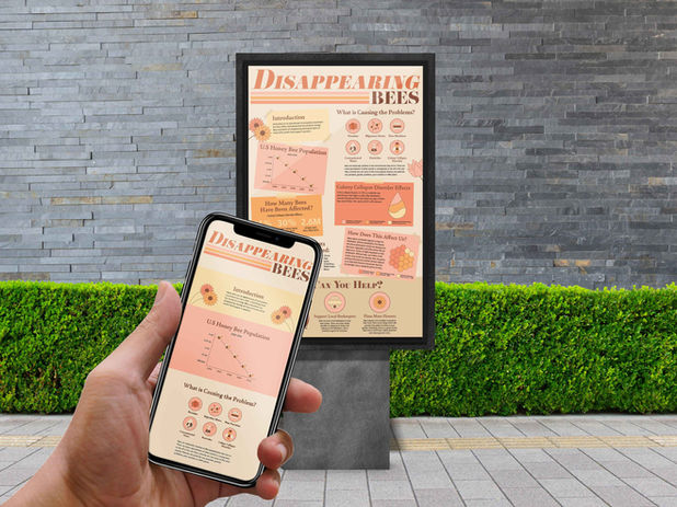
As an additional part of the infographic, I decided to create an online campaign/webpage to go along with it. People would be able to scan the infographic with their phones and this page would pop up. This webpage would have the same elements as the infographic but they'll be placed in a webpage. This adds an innovative twist to the old project and can raise more awareness by being online as well. See the sketches to the left.

One of the challenges when designing an infographic is being able to fit all the information in a logical way. Throughout the process of redesigning this infographic, I changed the layout a lot. Below, on the left, you can see one of the original layouts and on the right is the final layout.
The layout on the left doesn't emphasize any of the sections. They're all equal which looks nice but realistically, something needs to be more important. So, I had to sit back and decide what I wanted people to take away from this poster the most. I decided the most important thing to take away from this poster is what the viewer can do to help this issue.
So, for the layout on the right, the How Can You Help section is larger than the rest to emphasize it. If a viewer is only going to read one section, I would want it to be that one. Additionally, some other sections were moved around to help it flow and fit better.


Process
Final Design
After playing around with the layout and adding a paper texture, the poster was finished. The final design is warm and welcoming to read. The layout is logical and puts emphasis on the most important information. Overall, the space is used effectively and the design choices were well thought out.

Comparison
The old design was bright and had a fitting concept. Although, the colours lacked contrast and the type wasn't as effective as it could have been. The new design has a more refined and attractive colour palette. The type choices are more effective and thought out. Also, the layout of the new design is more logical and organized. Overall, the new infographic uses the spaces more effectively and the better design choices make it even more appealing.


Benefits
Mockups
The benefit of the new design is that it's more purposeful and communicates the information better. By being more intentional with the layout and overall design, the information is displayed better which makes it easier to read. The new design is also more eye-catching and will draw in more people to read it.


